


The redesign of Caldea's store products, driven by Ecodistrict, has marked a before and after. Previously, the store had a variety of items, but without a clear line or defined strategy: generic products were purchased and the brand was simply applied to them.
customer
The EMBASSY by SUÏSSA JOIERS
Data
2025
Services
Branding
Graphic Design
Packaging
Awards
Typeface Competition
D&AD Awards

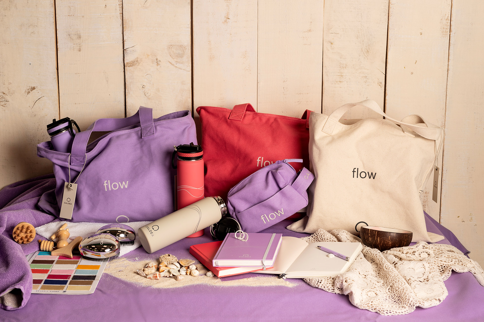
With the arrival of the new “Flow” concept and the renewal of Caldea’s corporate image, we proposed a new custom-designed collection, thought out from the ground up. It all started with a reflection on what would make sense to offer in the store, both in terms of brand identity and real utility.
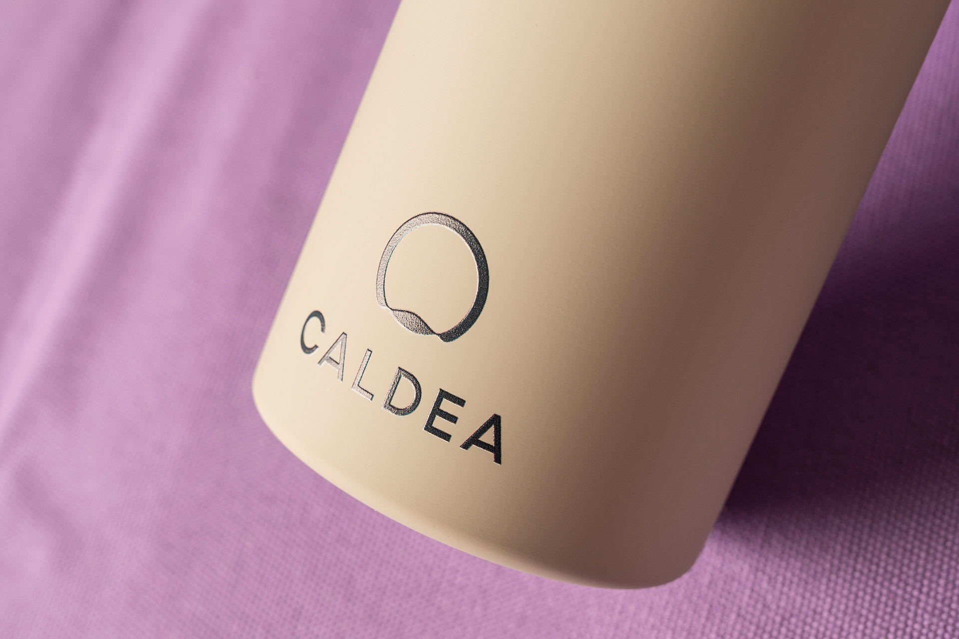
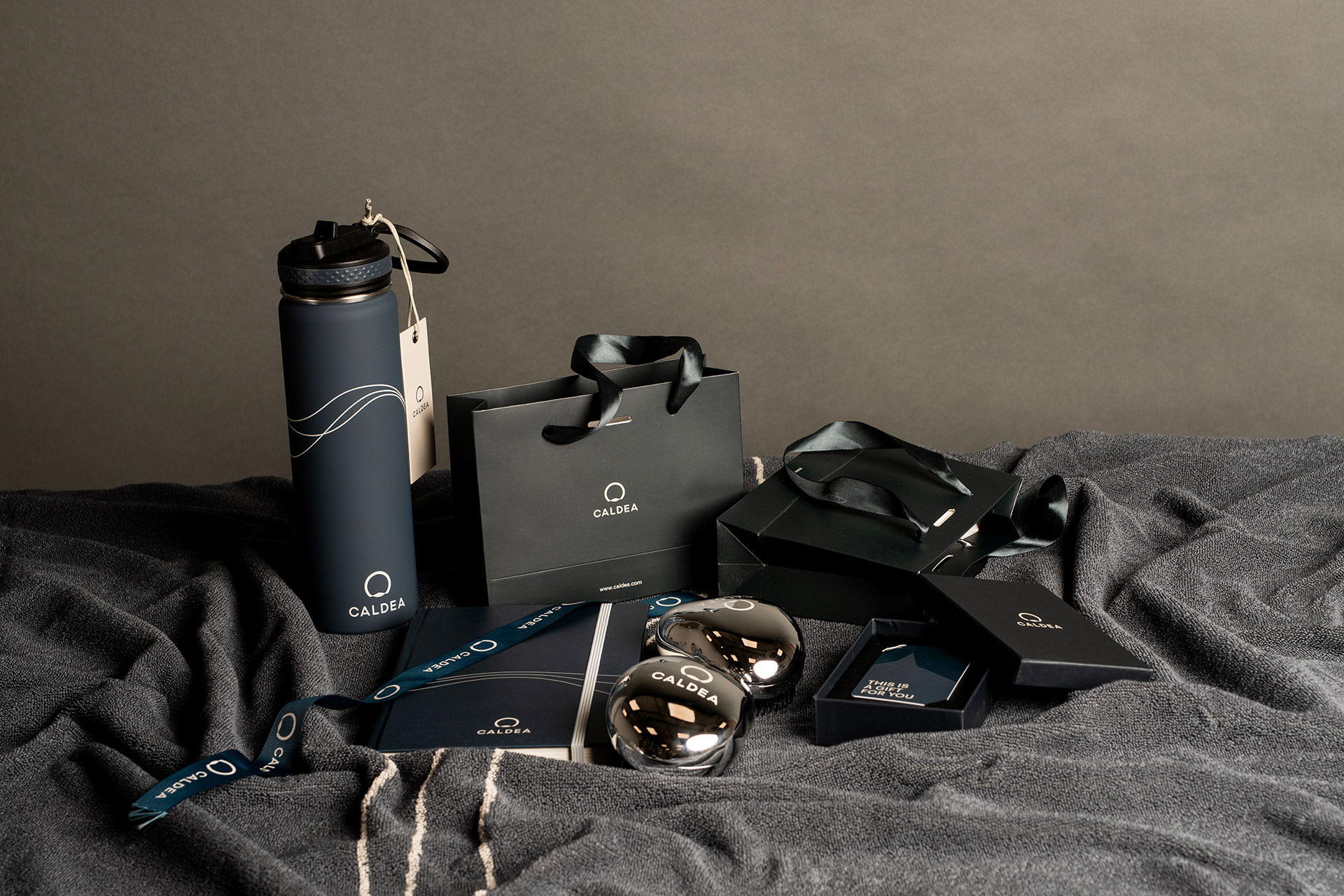
Thus was born a first line with tote bags, small bags, toiletry bags, bottles and brushes. The proposal was built with a more premium, elaborate and coherent aesthetic, using colors from Caldea's secondary palette —corals, lilacs…— to bring freshness and uniqueness.
The result? A range of products that not only conveys the Caldea universe, but that customers really want. They are functional, beautiful, and fit into their day-to-day lives. We made a clear qualitative leap: high-weight fabrics, very careful finishes, chromatic coherence in all applications (fabric, paper, embossed bottles, etc.), and a clear price hierarchy, designed to reach different profiles.
Furthermore, we understood that a brand like Caldea, which receives thousands of visitors eager to live an experience, had a great opportunity to turn its products into a tangible and desirable memory. The balance could not be more positive: excellent sales and a much more solid and attractive image.
We are currently developing a second collection to continue expanding this proposal, introducing new colors and items, and consolidating the brand strategy through the product.


